
GLIMPSE FILM
FESTIVAL
Identity & Editorial
2020 & 2024
Academic Project
Originally conceptualized in 2020, Glimpse International Film Festival was a collaborative project developed as part of my Advanced Diploma in Graphic Design. Partnered with two other designers, we were tasked with creating a film festival from the ground up — building a full brand identity and suite of design deliverables, with a primary focus on developing a cohesive and visually compelling program catalogue.
My role centered on crafting the festival’s visual identity, developed from my original logo concept. I led the creative direction for the branding, ensuring that the tone, aesthetic, and messaging reflected the spirit of the festival. The goal was to maintain cohesion while working collaboratively, building an identity that could support a wide range of visual applications.
In 2024, I revisited and redesigned the catalogue as part of a final-term opportunity to reimagine a past project. This allowed me to refine the original concept with a more developed skillset and a matured design sensibility, resulting in a more polished and intentional piece that fully captured the essence of the festival's brand. The re-imagination of the design was done as a solo venture.
The visual identity for Glimpse International Film Festival was designed with versatility and clarity in mind. Given the wide range of brand applications from small-scale formats like brochures and festival passes to large-scale projections in theatre spaces, the chosen typeface needed to retain legibility across all sizes. The result is a clean and sharp typographic system that supports the brand's presence both small and large.
The festival’s icon was directly inspired by the origin of its name. Glimpse speaks to the powerful moments film offers—brief windows into other lives, other worlds, and emotional landscapes. The symbol captures this concept through an isometric interpretation of a theatre space; a cubic structure with a projected screen, abstracted through contrast to evoke the feeling of catching a glimpse into the spatial experience of the festival. The interplay of shape and colour serves as a visual metaphor for perspective and storytelling which are principles that are also at the core of Glimpse’s identity.

(above) Here is a quick look at what the catalogue looked like in it's first iteration.

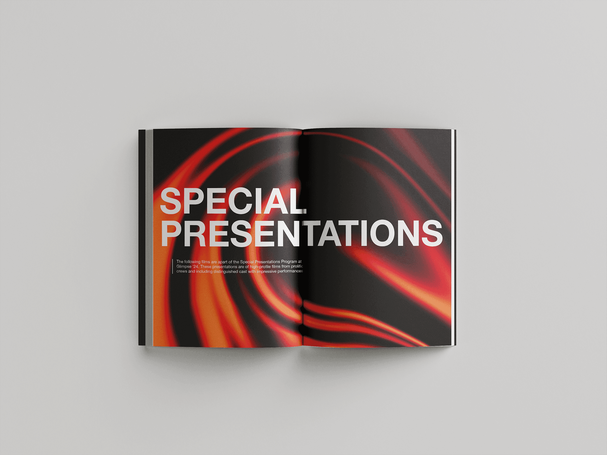


(above) And here is a look at what the redesign looked like, pulling a few spreads from the catalogue. Featuring clear sectioning, cohesive, expressive and dynamic design and a much more print-ready, festival-quality catalogue.